
Imagine you walk in a store and see this on the door –

What would you do? Push or Pull or both?
And what about this?
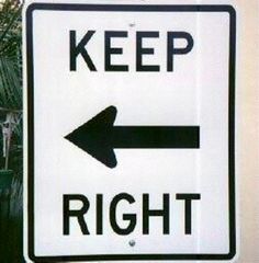
Did you just see your hands to check which one is right and which is left?
And this?

Now, you really wished you could fly! Didn’t you?!
And, this one below, may just offer a little too much. It has too many options to choose from.

These are some real world call-to-actions completely gone wrong. They may make you giggle a little but have nothing else to offer. These CTAs are confusing, irrelevant, ambiguous and completely ignored.
You don’t want this to be happening with your emails. Do you?
Back to the basics…
Call-to-actions are buttons that shout for an action to be performed. Apart from being used in websites and landing pages, they have been heavily used in the responsive emails these days. The commonly used ones are – DOWNLOAD NOW, DOWNLOAD THE APP, SHOP HERE, SIGN UP, ORDER NOW, BUY NOW, ADD TO CART etc. They are often the only purpose for an email to be sent and can be a huge traffic driver. Having said that, they can be ineffective if not used correctly. So, what are the characteristics of a winning call-to-action? What makes it click with the audience?
Characteristics of a good call-to-action
- The
ABCrule…Oops! The APC rule – Appealing, Persuasive, Compelling! Make the call-to-actions irresistible to your audience. - Let the CTA shout what is it about and tell people what to do. For example, ADD TO CART, SHOP NOW, ORDER NOW etc indicates what you want the customer to do and makes him aware that what action will be performed once he clicks on it. A call-to-action as vague as “CLICK HERE” might not give that kind of clarity.
- Keep it short. As a general rule, do not exceed more than 5 words. For example, which sounds better? – “CLICK HERE TO WATCH THE NEXT EPISODE” or “WATCH NEXT EPISODE”. The latter one is crispier and makes complete sense.
- Create a sense of urgency. For example – SIGN UP TODAY or BUY NOW or ORDER NOW. “NOW” creates a sense of urgency and chances of a customer clicking on it are higher.
- Don’t have too many call-to-actions. Ideally it should be one. But in some cases you can have at most two if it’s truly important and you can’t do without it.
- Make the call-to-action very clear and let it stand out. Don’t let it hide in the background image or the color or the text. Make sure you use the right color for your button and right font style and size for the text for your call-to-action which makes it stand out in the email.
- Use a lot of white space in your email so that your call-to-action is easily noticeable.
- Use buttons for your call-to-action instead of hyperlinks. Buttons are more familiar and considered to be clicked on.
- Test, test and test! Perform rigorous tests of your emails and see which version of the email responds better. There is no sure shot rule to success. You will only get to know your audience better with testing.
- This last tip is important especially for the mobile versions of the emails. If you have to include a phone number which can be dialed, make a “CALL NOW” button instead of a hyperlink like “Dial 111.111.111.111”. The click on the button should dial the number on the phone.
Call-t0-actions are powerful and effective to drive your audience to do what you want them to do. Don’t waste your emails with a useless CTA. If something doesn’t work, try a different version. Keep testing and learning. You will master the art in no time!
Like it? Tweet it!![]()
